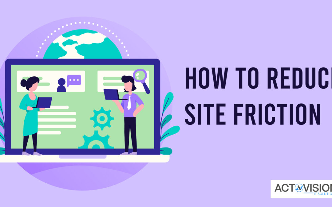
How to Reduce Site Friction
Are you noticing a sudden drop in the conversion rate?
Is the bounce rate graph getting steeper than ever?
One of the major factors behind an increased bounce rate or reduced conversion rate is website friction.
What is it?
Friction is anything that hinders the conversion journey of a potential lead. It affects user experience and in turn, drives the leads away.
So, how to reduce website friction?
Glad that you asked. Let’s explore.
1. Enhance Site Speed
Let’s start with a hypothetical situation. Imagine that you have engaged in PPC management services to drive visibility to your site. How would you like to drive traffic to your site through a PPC ad campaign, only to repel them away with a slow loading speed! This simply drains your resources!
Usually, people spend 2 to 3 seconds for a page to load (source: Google). They cannot browse products or services, learn about your brand, or finalize a purchase if the site lags.
So, regularly monitor your site speed and fix the issues as soon as they are noticed.
Here are some quick tips to improve your page loading speed:
• Compress image size (of course, without affecting its quality)
• Optimize the video file
• Leverage browser caching
• Select the right hosting option
We can go on listing these points, but let’s not get distracted.
Yes, it’s a strenuous job!
And as you might have guessed, this is even more complicated in the case of an eCommerce website since it contains numerous product pages and high-quality images. Also, if a lot of traffic access the site at one particular point in time, it will get even slower.
But you don’t have to worry as long as professional eCommerce website design companies are there to help you. With their experience and expertise, they will optimize your page loading speed.
By the way, do you know how to increase user engagement for an eCommerce site? If not, take a brief look.
2. Simplify Your Site Design
Indeed a website should have a unique design but never a complex one.
No matter how much you experiment with your site, make sure that it remains intuitive. For example, the house symbol leads to the homepage, three horizontal lines open the menu bar, and so on.
These will help the users to easily navigate your site. Remember, people spend about 0.05 seconds to determine whether to stay or leave your site (source: Swear). Naturally, none is going to spend time analyzing the navigation process on your site.
Also, make all the information easily accessible and place the search bar at an easy-to-locate section. This will further enhance the usability of your site.
3. Don’t Delay Conversion
Adding more steps before conversion is directly proportional to a reduced conversion rate.
Why?
Simply because it will demand more activity from the potential customers and they may leave the site without completing a purchase.
Also, remember that impulse purchase is an important revenue-driving phenomenon in the eCommerce world. Quick fact: impulse purchase represents over 40% of all the money spent on eCommerce sites (source: Invesp).
And you cannot expect these impulsive buyers to spend a long time in signing up before purchasing a product!
Here are our suggestions:
• Make the sign-up process optional and include a guest checkout option. If you want the customers to sign up for your site, you may show a pop-up message that requests them to sign up after the purchase is done.
• Reduce requirements during the checkout process. If possible, get the conversion done with the only name, address, and contact info.
• If someone already has an account on your site, make sure that most fields are auto-populated. This will make the action frictionless.
Take a quick look at these pro tips to audit your site. This will further help to improve conversions.
4. Autocomplete to the Rescue
Autocomplete is a useful feature, especially in an eCommerce site. It improves the search experience by reducing the users’ work.
Here, once a user starts to type, the related products are suggested. Autocomplete also helps users once they are unsure of the spellings they are typing. That way, the users can find the right product they need.
Take for example, if someone is unsure how to spell the name of the Russian author Lyudmila Stefanovna Petrushevskaya, autocomplete is there to help.
The same is also applicable for the travel sites as well.
Incorporating such a feature into your site demands adequate knowledge and expertise in designing a website. If you are not much of a tech-geek, consider engaging professional website design services.
5. Set a Clear Focus
Remember you started the business with a goal?
With time your services may expand and more landing pages can be added to your site. But cluttered content may cloud your objective and confuse the leads.
So, ensure that all the pages include a powerful CTA underlining your business objective so that the customers don’t get distracted.
Also, make sure the main value proposition of your business is accessible through the main menu.
6. Create a Mobile-Friendly Site
Nowadays, having a mobile-friendly site is the bare minimum for any website. And you must optimize your site for mobile devices.
The objective of a mobile-optimized site is to make the website frictionless for mobile users. That’s why it displays larger navigation buttons, differently sized images, and so on.
You may check your site’s mobile-friendliness by taking a Mobile-Friendly Test on Google Search Console. It makes you aware of various issues like content is wider than the screen, the text is too small to read, clickable elements are clustered together, and others.
These insights will help you to rectify the problems and enhance user experience. And for any assistance, you can always contact a website development company.
7. Use Less Number of Ads
A huge number of irrelevant ads only clutter your web design and affect the user experience.
This is a sure nuisance to impact the visibility of your site’s content. And what’s the point in writing and optimizing content if the users cannot read it properly! They will only get irritated and leave the site, enhancing the bounce rate.
Remember, less is more when it comes to placing ads on your site.