by actovision | Apr 8, 2022 | Design, Web Development
What is the MEAN Stack?
Developers have always valued the ability to build their applications on integrated stacks of foundational technology. By using a set of standardized building blocks, they can spend more time working on applications that differentiate the business, rather than gluing lots of separate components together.
What is the MEAN Stack?
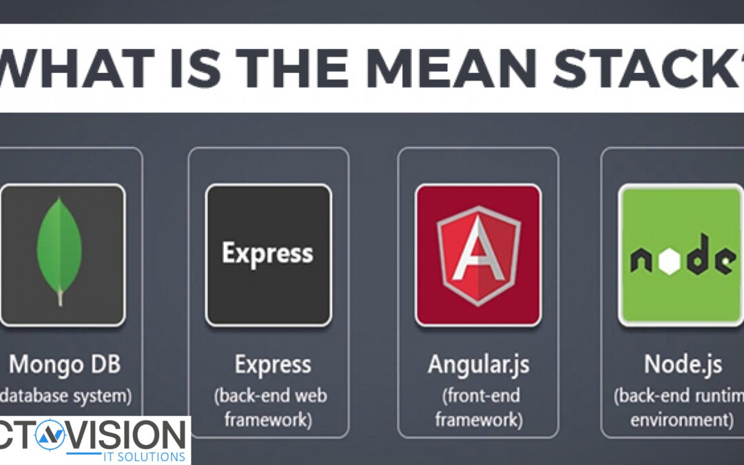
The MEAN stack is a JavaScript-based framework for developing web applications. MEAN is named after MongoDB, Express, Angular, and Node, the four key technologies that make up the layers of the stack.
- MongoDB – document database
- Express(.js) – Node.js web framework
- Angular(.js) – a client-side JavaScript framework
- Node(.js) – the premier JavaScript web server
There are variations to the MEAN stack such as MERN (replacing Angular.js with React.js) and MEVN (using Vue.js). The MEAN stack is one of the most popular technology concepts for building web applications.
How Does the MEAN Stack Work?
MEAN Stack Architecture
The MEAN architecture is designed to make building web applications in JavaScript and handling JSON incredibly easy.
MEAN Stack Components
Angular.js Front End
At the very top of the MEAN stack is Angular.js, the self-styled “A JavaScript MVW Framework” (MVW stands for “Model View and Whatever”).
Angular.js allows you to extend your HTML tags with metadata in order to create dynamic, interactive web experiences much more powerfully than, say, building them yourself with static HTML and JavaScript (or jQuery).
Angular has all of the bells and whistles you’d expect from a front-end JavaScript framework, including form validation, localization, and communication with your back-end service.
Express.js and Node.js Server Tier
The next level down is Express.js, running on a Node.js server. Express.js calls itself a “fast, unopinionated, minimalist web framework for Node.js,” and that is indeed exactly what it is.
Express.js has powerful models for URL routing (matching an incoming URL with a server function), and handling HTTP requests and responses. By making XML HTTP requests (XHRs),r GETs, or POSTs from your Angular.js front end, you can connect to Express.js functions that power your application.
Those functions in turn use MongoDB’s Node.js drivers, either via callbacks or using Promises, to access and update data in your MongoDB database.
MongoDB Database Tier
If your application stores any data (user profiles, content, comments, uploads, events, etc.), then you’re going to want a database that’s just as easy to work with as Angular, Express, and Node.
That’s where MongoDB comes in: JSON documents created in your Angular.js front end can be sent to the Express.js server, where they can be processed and (assuming they’re valid) stored directly in MongoDB for later retrieval.
Again, if you want to easily get the best of MongoDB, you’ll want to look at MongoDB Atlas. This will allow you built-in full database security and cross-cloud scalability with the click of a button. More on that later on this page.
Advantages of the MEAN Stack
MEAN applications can be used in many ways with a cross-platform write once approach. While MEAN is particularly suited to real-time applications, particularly those running natively in the cloud and single-page (dynamic) web applications built in Angular.js, it can be used for other use cases such as:
- Workflow management tools.
- News aggregation sites.
- Todo and calendar applications.
- Interactive forums.
And much more.
Since all the components are based on JavaScript and JSON, the integration between the components of the stack is intuitive and straightforward.
Additionally, the E and A of MEAN (Express and Angular) are two of the most popular and well-supported JavaScript frameworks for back-end and front-end development, respectively. Express makes routing and managing HTTP requests and responses super easy, and includes great support for middleware to handle JSON endpoints and form posts. An angular is a powerful tool for building dynamic HTML pages that communicate with a back-end server.
Whether you’re building a high-throughput API, a simple web application, or a microservice, MEAN is the ideal stack for building Node.js applications.
All of the MEAN stack components are open source in nature and therefore allow a generous, free-of-charge opportunity for developers.
Disadvantages of the MEAN Stack
JavaScript is a great modern language, but it wasn’t initially designed to build back-end servers. Since the foundation of the MEAN stack is JavaScript, including the back-end server, it might come with concurrency and performance problems at scale due to its JavaScript nature.
Additionally, since the development opportunity is so rapid, business and server logic might suffer from poor isolation, making potential spaghetti code and bad practices a reality along the way.
Finally, although there are many guides and tutorials out there, they generally will not include concrete JS coding guidelines appropriate for this stack. Therefore, something that worked really well for one application might surface issues for another.
When Can the MEAN Stack be Used?
MEAN follows the traditional three-tier stack pattern, including the display tier (Angular.js), application tier (Express.js and Node.js), and database tier (MongoDB).
If you’re building a JavaScript application, particularly in Node.js, then you should give MEAN a serious look.
MongoDB stores data in a JSON-like format (BSON, a binary JSON extension), the MongoDB Query Language (MQL) is defined in JSON, and its command-line interface (CLI) is a JavaScript interpreter. Not only is MongoDB essentially a JavaScript/JSON data store, but it’s full of advanced features like indexing and querying deep into JSON documents, has powerful native Node.js drivers, and is designed for horizontal scale-out. It’s even easier to develop apps in the cloud using MongoDB Atlas, the cloud-native Database-as-a-Service from the creators of MongoDB.
Whether you’re building a high-throughput API, a simple web application, or a microservice, MEAN is the ideal stack for building Node.js applications.
Using MEAN Stack with MongoDB Atlas
The MongoDB Node.js driver makes working with MongoDB from inside a Node.js script simple and intuitive for developers—saving developers time and increasing their productivity.
Next, you’ll need a MongoDB database. The easiest way to get started with MongoDB is to create a free cluster in MongoDB Atlas, MongoDB’s fully-managed, multi-cloud document Database-as-a-Service.
Atlas databases are easily deployed and scaled, providing you with a consistent URI to connect. See the official MongoDB documentation on connecting to a cluster.
Along the way, Atlas connections come with built-in username/password and TLS end-to-end encryption by default. Additionally, it allows you to utilize advanced MongoDB security features such as certificate/IAM authentication, LDAP, Encryption-at-rest, and Auditing with the click of a button.
Moreover, an Atlas project can utilize the MongoDB Realm applications platform to easily integrate many authentication providers such as Google, Facebook, JWT, and custom authentication.
Scaling and Managing Atlas is very easy; its biggest benefit is that it supports and secures the MEAN stack’s most valuable layer: the data layer.
How Secure is the MEAN Stack?
We recommend using the MEAN stack with MongoDB Atlas since Atlas has built-in credentials, a firewall, and end-to-end encryption which is the best foundation for securing your MongoDB.
Additionally, the MEAN stack has a concrete three-tier separation which, if used with best practices and correct network isolation, should prevent your end-users from having access to the business logic and moreover to your database layer. Therefore, your application is by default designed to avoid malicious user interaction from putting your application at risk (Query injection, code manipulation, port spoofing, etc.).
by actovision | Mar 14, 2022 | Design, Web Development
How will Web design look like in 2022? We are only halfway through 2018, so it’s not easy to tell what the next six years of design will bring. However, there are certain trends that we can already see on the horizon—keep an eye out for these ten 2019 web design trends, and think about where they might take us in 2022
Simplified Web Pages
One thing that will change dramatically over time is Web pages themselves. As our devices become more powerful, Web designers are going to have even more capabilities to showcase. But these advancements also mean that there will be a lot of information on any given page, and it’s going to be challenging for our brain-based browsers to process it all. Websites are likely going to trend toward a much simpler design in order to ensure readability and usability.
Faster Loading
As of 2017, Americans spent an average of 7 hours online every day, and it’s predicted that figure will reach 8 hours by 2022. As we spend more time browsing and interacting with our computers, websites will have to become faster and more efficient. To compete in a world where users can just leave your site if it takes too long to load, web designers need to find ways to make their sites load as quickly as possible.
Mobile-First Approach
With Google planning to put mobile-first indexing into full force as of 2019, how your site looks on a smartphone or tablet will soon be even more important than how it appears on a desktop. Make sure that your responsive website’s design keeps mobile users in mind at all times. The average time spent on a website by someone using a mobile device has increased from just over five minutes to almost 15 minutes since 2013.
Better Use of Visual Hierarchy
We’re currently seeing websites that use images a lot more frequently—but they often lack a good visual hierarchy. If you’re looking to add more imagery to your site, here are three things you should know: (1) Use large, high-quality images whenever possible; (2) Use smaller graphics when you can’t; and (3) Keep visuals for visitors and text for search engines. But if you want to stay true to Google, there are lots of resources out there.
Animation and Video as Confirmation
Why do we even have to wait for your site’s download time to be over? Virtual Reality is gaining an increasing amount of popularity and adoption with consumers, so it’s not surprising that web designers are looking at integrating these technologies into their sites. With virtual reality, you can communicate more effectively with clients without worrying about language barriers—all they need is a headset! Why bother sending brochures or writing lengthy proposals when you can just send them a link?
Increased Attention to Content Strategy
With millions of users and billions of monthly page views, keeping your website up-to-date is no easy task. In order to stay on top of things, it’s important to invest early in a strategy for content creation.
by actovision | Feb 12, 2020 | Design
Your website is your online hub acting as a business card, sales pitch, listing, advertisement, a showcase of products or services, and many more at the same time! Just how you renovate your house on a timely basis, your priceless website, with all the mentioned job roles, also requires a renovation in a certain time gap. Most of the websites, if not all, require a redesign at multiple points of time in their life cycle. The need for a website redesign may occur due to different reasons, namely, changing trends, new business requirements, scalability, etc.
A website redesign can single-handedly boost your website traffic and business revenue by offering enhanced user-friendliness to the online users, both aesthetically and functionally. While the outcome is hugely beneficial and effective for a business, the redesigning process, however, requires a lot of attention and considerations.
Website Redesigning Factors to Consider for a Website Revamp
For a major undertaking like website redesign, we have come up with the most important website redesigning factors to make your job easy. Consider these factors before you start the redesigning process.
Determine the Goal of Redesign
You cannot wake up one morning and decide to get your website redesigned. That’s not the way the whole procedure should go. You need to ask yourself why you want to redesign your website. The question can be deceptively complex yet an obvious one for any website owner opting for a redesign since there can be more reasons than one and each one calls for a different technique to be availed!
The reasons can range from a requirement of a better-looking site to a more functional site, or a site with improved SEO and conversion rate. Apart from these reasons, switching to a whole new different domain can also be a viable reason for the redesigning. Thus, we will recommend you to make a list of what you want to achieve through your redesigned website, hand it to the website design company you’ve hired, and focus on the end goal.
Set Smart Goals
Since we have already stated that defining a goal is very much critical for any website redesign process, it’s time that we convey to you what type of goals really matters! Making a smart goal will always place you on the profitable side and choosing the wrong goal will get you ruined! The bottom line is, you should never opt only for the designing and aesthetics but the SEO and marketing should always be prioritized.
That’s not to say that you should not pay attention to the design or design does not help your marketing efforts. However, if you forget about the function to focus on the aesthetics, that’s the point where the mistake is being made. Basically, a simple website would always help the user experience but the visually fancy websites with tons of codes will only end up making the site heavy, increasing loading time, confusing navigation, etc. So, set goals with marketing and revenue in mind because, at the end of the day, it matters.
Major or Minor Redesign – That is the Question
Now, since you have already decided why you want to have your website redesigned, it’s time to consider how much revamp your website requires as per your goal. In some cases, a little change in visuals will get the job done and sometimes you may require adding new functionalities or features to the website. On the other hand, the whole code base may also be needed to change for a complete revamp of your old website.
However, the large overhaul is not always possible due to budgetary liabilities but it can be considered for the long-term cost efficiency. So, as you can see, there are many possibilities and you need to think about your business’s future endeavors and scopes to determine which kind of redesign you should opt for.
Identify What’s Effective and What’s Not in Current Design
Before making the redesign happen, it’s wise to inspect your current website and reckon those elements or sections that are working fine! No matter how large or small your website is, there will always be some sections of your website that are completely functional and effective on the audience. So, if you go for a complete website redesign, chances are, you’ll end up redesigning the segments that have been already doing well!
Thus, it becomes extremely vital to analyze your existing website. Take a deep look at your website’s CTA, pages, and content. Decide which are well-performing and which are not as per your requirement and industry standard. Determine how to improve your website’s CTA, content and pages. Also, keeping the former working design elements intact will help you satisfy the returning customers.
Your website’s blog, gallery, and product/service sections may be the biggest considerations for redesigning as these three bring the highest number of traffic. So, keep a sharp eye, detect which of them is working currently and which are not. If some of them don’t work properly, you know what to do! A redesign!
Know Who is Your Audience and How They’re Using Your Site
When you opt for a redesign, make sure that you are monitoring how your users are using your website. When you identify how your website is being used, it will be easier for you to rectify the loopholes in your site and identify the well-performing segments. In order to do so, you may study your website analytics and traffic statistics which will help you know multiple factors like:
- Where your traffic is coming from
- The most common entry and exit pages
- Which country (or region) is generating the greatest number of traffic for your site
- Which are the keywords generated on your website or web pages
All these facts and figures will aid you in understanding your visitors, how they are finding your website, what they do on your site, at which point they leave and why. However, in order to understand user behavior, you also require some other factors to consider such as:
- The browser
- Screen Resolution
- Device
All these data will help your website developer determine the technical specification of your website while redesigning it. Furthermore, it will also let you decide whether or not you need a distinct mobile-version of your website.
Spy on Your Competitions
You must be familiar with the maxim that suggests you keep your enemies closer! Yes, it’s absolutely applicable when you are into business and dealing online! There’ll be thousands of your competitors working day and night to snatch the spot you’re willing to acquire. Your competitors may be implementing some great strategies on their websites to dethrone the others and if you want your website to do the same wonder, you have to learn from their activities. Moreover, you can build some better redesigning strategies that would beat them down in the race to be the best.
Try to figure out what you are missing that they can successfully implement, what their website has that you don’t! In order to assess the sites and do the comparison effectively, you should get into the customer’s shoes and see the sites neutrally. Think what you would have wanted in a site and what would have encouraged you to make a query or make a purchase. Once you find the mutilations in your site, get a website developer on board and ask for a website redesign.
Is There a Change in Your Brand Image?
If your business or company has gone through any changes, that should always be reflected on your website. As said before, your website is your online identity and if your identity is modified, your users have the right to know about it. Update your new brand image or changes on your website even if it’s only visual. There are certain vital elements that require your attention and need a quick update.
- Your website Logo
- A color overhaul for conveying the change in philosophy or corporate image
- Your terms and conditions
- Change in associating Partners
Your website is the first impression of your business for the millions of online users. So, alongside your brand identity or company image, your website should grow and nurture. And the redesign is the only way to do so.
Review Content and Create New Content Strategy
Your design and content work together to make the right impact on the potential online consumers. Content is the king, as Actovision IT Solutions has always mentioned. Thus, making a fresh content strategy will help your site retain the exposure. While thinking about a website revamp, content should be one of your top consideration for the redesign. A fresh and advanced content strategy would allow your site to reach the new limits in terms of user engagement and search engine ranking. After spending a remarkable time in the website designing industry, we can give you a few ideas to make your content strategy better.
- Mark the old and outdated content and blogs. Either eliminate them or rewrite.
- Publish blogs on the basis of the user engagement as you will see there’ll be a time when your users are active the most.
- Single out the contents that are performing better. Take the content as a benchmark for future content.
Check the Responsiveness
Mobile browsing outnumbered desktop browsing in 2016 and 3 years have passed since then. So, you can assume how many more mobile users have been introduced to the internet. They may browse your site while traveling or while sitting in a café. Thus, you have to be smart enough to cater them a site that is mobile-friendly. Otherwise, they are going to say a firm ‘bye’ before you even realize!
That mobile-adaption or any small-screen adaption is called responsiveness. You must know the fact that mobile-friendly design is one of the most primary factors for ranking, as per the Google guidelines, namely, Mobile-First Index. So, responsiveness is a big aspect of your website redesigning. If your site is not responsive, make sure that you make it in your redesigning process. You always have to add more to the users’ browsing experience and mobile responsiveness is a vital part of that. If your website is not responsive, it will simply lose a lot of viewers and they are not coming back for sure.
Go Through the SEO Checklist
As we said at the very beginning, your redesign process should always support your marketing effort. When it comes to the marketing of a digital product on a digital platform, SEO is one of the most important factors for digital marketing. During the redesigning process, you will have to pay attention to many aspects which are as follows:
- Page title and meta descriptions should be well-written and optimized with keywords.
- The permalink of all your web pages should be short and properly optimized with the keyword.
- Your content should have headers with defined and structured header tags.
- The content should be unique, readable, and comprehensible.
- Top keywords should be targeted for maximum traffic.
- Website loading time should be minimum, within 3 seconds.
Whatever you do, you should always go through an advanced SEO checklist before anything else. That would let your site market well!
Are You Using a Premade Template?
The platform of your website will be a defining factor for your website. If you fail to choose a good platform, you are going to suffer in the future. Many website owners choose WordPress for their website and develop a website based on the CMS and premade template. But let us tell you that, using the premade template would not make you unique as there are thousands of more sites using the template of your choice.
So, instead of using a template, developing the site from scratch will help you get your hands on a more unique design! In order to survive and shine in the digital world, you need to be unique and your redesigned website should serve a uniqueness too!
Is Your Website Secure?
One important factor in today’s world is the Security. And the security can be a concern which may call for a revamp. While using the premade templates or a popular CMS like WordPress, there can be many security breaches hidden in the codes. So, you need to identify them all and eliminate them by redesigning your site.
The redesigned site should be secure and have the codes written with security measures in concern. Also, opt for an SSL Certificate if you don’t already have it incorporated on your website. When it comes to your website data, it can never be compromised as your business is concerned with it. So, make sure you are making your website secure during the redesign process.
Does Your Site Load Fast?
Website loading time is one of the key factors for a redesign as it would define the future of a website. If your website does not load fast enough, it will end up dissatisfying the users who are accessing the website. No one ever wants to wait for eternity for a site to load. They will simply leave if it takes too long for a site to load completely.
For determining the best website loading speed, you need to analyze the market and the top websites in your niche. Observe their loading time and determine yours. Also, prioritize the mobile site loading time as it will impact your ranking as per the latest Google algorithm. Generally, 3 seconds is the maximum time limit for website loading. But your case may be different as there are many aspects to consider such as the weight of your website and the average internet speed of your audience.
Try to Create the Simplest Navigation
Navigation is a viable website redesign factor to consider if you want the redesigned website to work out. The navigation of your website will determine how long your website visitors are going to stay on your website. While the complex navigation structure will confuse the users to visit further pages on your website, the simple navigation will do the wonder and let your audience access your web pages easily for more information.
If you add further pages on your site, make sure they are included in the navigation in the easiest way possible. Otherwise, the navigation will only increase the confusion among the users which can be lethal for your website. Crafting a nice navigational structure is particularly important for the large sites with many pages. In order to get the finest navigational structure, brainstorm and consider how easily a user can visit a page while staying on another.
Which CMS Do You Need?
The selection of your CMS will be a defining factor for your website and overall business. While the CMS helps you manage your website easily, it creates some limitations on the other hand. When you choose a CMS during your redesign process, think about the limitations it may create during your operations in the future. Consideration for scalability should be your primary viewpoint if you’re hopeful about the growth of your business.
Consider whether the benefits and features of the CMS will be enough for satisfying your consumers through your site. Will there be any threats like bugs or security issues associated with the CMS you have chosen? Overall, WordPress can be a suggested CMS as it comes with a range of plugins and notable features for the website owners. However, you need to check the eCommerce CMS specifically, if you are running an online store. But the last call is yours as you know your business more than anybody else.
When to Launch Your Redesign and How?
It’s all about marketing these days! And you should focus on the ‘when’ and ‘how’ of your website redesign launch. The time and approach of your redesign launch can deeply impact your exposure and the buzz among the traffic since the highest level of interest needs time to build. And when you launch your newly designed site or product during the peak interest of your traffic, the buzz is enormous and astounding.
However, you can also make slow changes in a timely interval without making an announcement about it. And if the changes are effective, it will also improve the user experience and traffic on your site. There’s no doubt about that. But on the other hand, when you fix a grand relaunch date and marketize the date across e-newspapers and other online promotional places, the buzz around your relaunch gets bigger and people anticipate about the changes you are going to come with on your redesigned site. This way, you are not only going to improve the user experience but you are also going to see an astonishing hike in user engagement.
Make the Transition Smoother. How?
When you are redesigning your website, there will surely be changes on your site’s front-end. Now, if your site already receives a good amount of regular traffic and lots of returning customers, some of them will not be much impressed with a drastic change in your website design and functionality. Since the general human psychology loves to stay with the habitual activities, the dramatic change on your redesigned website can make them disappointed. Moreover, the sudden sweeping change in your design can lead your site to lose the search engine ranking and backlinks acquired over years of hard work.
You must be finding a way out of this hassle! Well, you need to keep the vital and actionable elements such as navigation or header of your site similar to the older one. Always remember one fact that the redesign is the evolution of your older design, not a replacement. But if you have to replace and make a drastic redesign, make sure that the vital information about the modification in design and functionality is already conveyed to your users through a blog post or a press release. This way, they can be prepared for the change.
Now, when the users are satisfied, the search engine comes to the scenario. You should never neglect the search engine spiders as they are the reason why you are ranking or going to rank. Make the 301 redirects for the moved content. Create viable meta titles and descriptions for the search engine crawlers to identify pages. On the other hand, the error pages of your site should contain useful information for the users about the error.
Website redesign may sound like a peanut but it’s a juggernaut in terms of the amount of efficiency needed. A redesign is the base of your improvement as a business. So, you have to be careful during the redesign process. Taking it lightly will end up investing money without any return. The website redesigning is practiced to enhance your website’s user engagement and user experience as per the Google, Yahoo, and Bing guidelines. You may not be able to plan your redesign being a non-technical person but you can always consult an efficient web design company to guide you throughout the process.
by actovision | Feb 12, 2020 | Design
Every business requires a website for ensuring its progress and resultant success. But, today it is not just about looking good on the monitor of a desktop computer. Swift progress in the extensive field of Mobile Technology has led several portable devices including Smartphones and Tablets etc. to become the inseparable parts of modern-generation lifestyle. In this fast-paced modern world, people do not wait to go home to going online, since these advanced portable devices can do everything that a computer can do.
It is obvious that the screen resolutions and aspect ratio would vary while using these portable devices. Often, the Tablets and Smartphones fail to showcase the web content in a proper way. This design has appeared like a knight in shining armor to fix this issue.
Today, Responsive design has reared its head as a very common feature in most website themes and templates. Websites with such design are developed to automatically fit any screen size, giving the visitors an optimal viewing experience no matter which device they are relying on. Here are a few important reasons to consider making the switch. Have a look-
-
- Search engine advantages: The Search engine is intended to return results that allow a good user experience. Mobile and Tablet friendly search results always stand out in the overall ranking. Most of the users tend to switch to another site if they find a poor performance of a website on mobile devices.
Such designs offer better user experience and subsequently, ensure the improvement of search engine optimization. Moreover, the latest update of search engine giant Google says that the mobile-friendly websites will have a better chance to rank in the search results.
-
- Consistent user experience: This design is flexible and would adapt its layout depending on the size of a user screen. It ensures that your website will always proffer the best possible experience to its viewers. Plus, it does not take too long to load. Thus, it determines a better user experience by enabling internet users to get their information in no time. In a nutshell, Responsive design is all about providing a consistent and enriching user experience regardless of whether the users use a Laptop, a Smartphone or a Tablet.
- Increase sales: User-friendly Responsive websites do a better job of converting visitors into customers. By eradicating all the barriers to your website, this web structure will lead to a quicker intake of the customers. Aside from increasing sales, it helps analyze a website’s overall performance.
Research says that most of the users who visited a mobile-friendly site have a tendency to get back to the same site in the future for making a purchase. By providing a unified experience, easy navigation facility, and consistent usability, this site always ends up boosting the sales.
-
- Information is accessible: Responsive Design has projected to the screen after the content layouts are calculated according to the screen size and resolution of a portable device. Armed with this optimal approach, the web pages are always displayed better as well as faster, with ideal font size. Hence, the device capabilities never become an impediment to the desired information or ideal display.
Responsive design has spread like wildfire in the last couple of years. Today, every blooming business tends to get a leg up on its rivals by switching to responsive website designs. With loads of impeccable functionalities, this web design can really help your business stay ahead of the competition always.
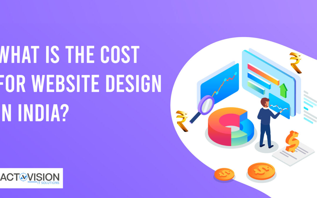
by actovision | Feb 11, 2020 | Design
For a business owner looking to hire a website development company in India, nothing can be more confusing than the multiple pricing variations and numerous rates quoted by different companies. As everyone who has tried to get a website developed in the country clearly knows, the process is easier said than done.
When you are in the market to develop your website, you have a lot of options to choose from, ranging from small-time developers who work independently and offer the promise of cheap prices, to reputed website design services in India who offer you multiple packages and different price points.
If you want to settle these questions once and for all and gain a clear understanding of the website design costs in India, then read on below.
Best Website Design Services In India
You may be enticed by promises of cheap rates and fast results, but beware: if something sounds too good to be true then it probably is. The following are some factors that you should keep in mind while choosing your website design service in India:
- Reputation- This is perhaps the most important factor to consider. A reputed web development agency is most certainly the one you should go with. Be sure to do your due diligence and background checks before settling on a company.
- Adequate Wisdom- Not all website development companies are created equal. Specialization and adequate wisdom should determine your choice of the development agency. For example, if you are looking to develop an eCommerce website, then go for the eCommerce website design services; if your requirement is a personal blog, the look for a company that specializes in such work.
- Supplementary Support- If possible you should always opt for a company that can help you not only with your website design but with other associated services such as SEO, social media marketing and content creation as well. Choosing a company that provides this additional support could help your web development efforts to a large degree.
These are some of the basic points you should keep in mind to zero in on a website development company in India that’s just right for you.
Factors Which Determine The Cost Of Website Design In India
Whether you are looking to get an eCommerce website design in India or create a web application, various factors determine the actual cost of trendy website design and development. Some of these are below:
- Number Of Pages- The number of pages you need to design will largely determine the cost of your website. The total cost is usually commensurate with the number of pages on your website.
- Responsiveness- The cost of web design is also determined by the fact that whether you want your website to be responsive. Considering the fact that most major search engines favor responsive sites in their rankings, you certainly want your website to fit into this criterion.
- CMS Integration-The use of a CMS such as WordPress makes the maintenance and subsequent updating of your site a simple process. Hence while determining the cost of your web design you’d do well to factor this in.
- Additional Features- Other features that determine the cost are on-page elements, social media integration, and web hosting costs among others.
by actovision | Feb 6, 2020 | Design
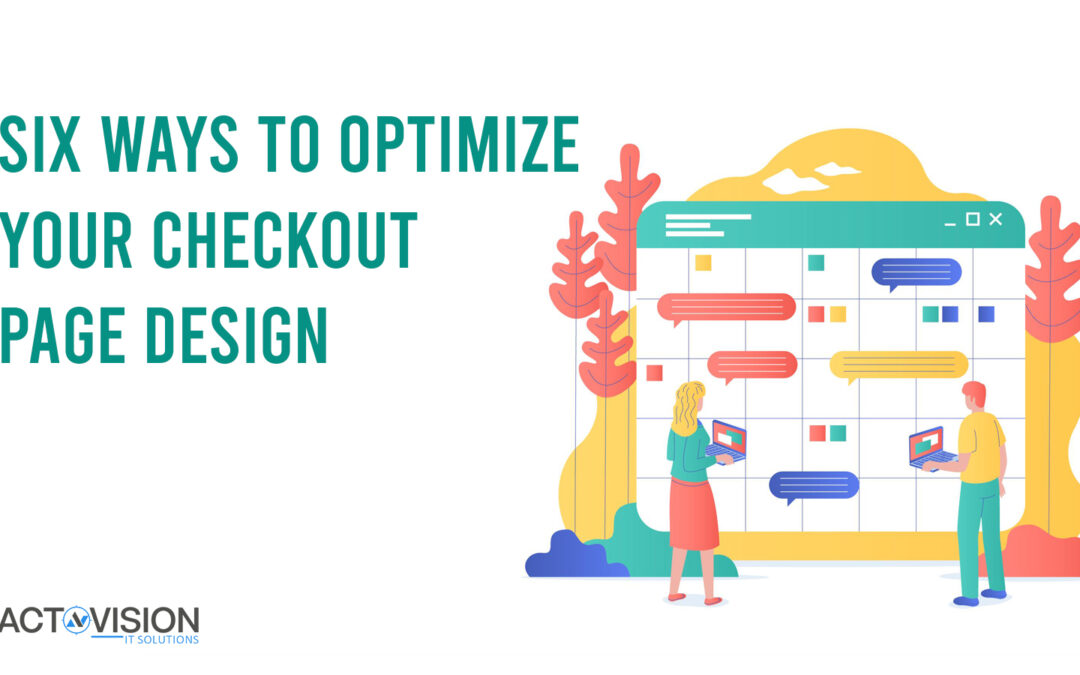
The most plaguing issue for an eCommerce site is cart abandonment. It is seen that the average value of carts abandoned during checkout is quite high which means that you are losing out on a size-able chunk of sale. This leads to a drop in conversion rate which is not a good sign for your site. It will also result in a drop in your SEO which is disastrous for any website. Hence, this is something you must avoid at all costs. Researches point out a few common mistakes made by e-commerce sites which are responsible for a bad checkout experience and therefore, a high cart abandonment rate. Here are some of the steps you can take to give your customers a better checkout experience, thereby ensuring a good conversion rate.
Offer guest checkout
Making it compulsory for your customers to sign up is redundant. People often have short attention span and may not want to waste time on signing up. Moreover, a lot of people find it tedious to open accounts and remember passwords hence they just abandon their cart when you ask them to sign up to continue. Always give your visitors an option to checkout without shopping. If you want to encourage your visitors to sign up for your website, you can offer them some discount on signing up but ensure that this option is never put on the checkout page. Apple has done a great job in increasing their sales by adding a guest checkout option.
Don’t add hidden fees
Mention all the additional costs like shipping, handling, taxes etc on the product page itself instead of putting them at the end during checkout. that way they can get an estimate of their expenses beforehand. Customers feel extremely annoyed and even betrayed when they see extra charges added up over their estimate during checkout and tend to abandon their carts. If possible integrate the taxes and other additional costs in the price of the product itself so that the customer doesn’t have to bother with additional costs.
Add progress indicator
Customers tend to get impatient in multi page checkouts. If your checkout is a process which involves several pages, make sure that you add a progress indicator for the customer to know how far the end is. The most popular way to do this is to add a progress bar on top to show how many steps are left. This acts as a motivation to continue, else your customer might get frustrated and quit midway.
Don’t redirect while checkout
Customers shopping online are usually extra wary because of all the scams floating around. They are insecure about sharing their details on an unknown website hence it is advisable to host your own checkout page. The moment your customer is redirected to a third party website, they will be wary of sharing their account and personal information and
Multiple payment options
Customer, especially the elderly ones or those who are new to online shopping, usually harbour a mistrust when it comes to sharing their account details online. There is a persistent fear of getting their bank accounts robbed by hackers. Moreover they are wary that their money might be stolen by the website itself. To ensure that you cater to a wider demographic, always add an option to pay on delivery. It is assuring to be able to pay once they get their product hence they don’t abandon their carts.
Better Forms
It is true that you need to know all the details of their shipping address to be able to send the package but if you make your forms, less complex and with auto fill option for future shopping sprees, customers will be encouraged to shop again and again. Even for first time customers, you can add some simplifying features like drop down menus for locations, or prediction based on pin code, this will make their work easier and give then a positive shopping experience.
You can easily reduce the rate of cart abandonment if you take the steps as mentioned. It is best that you hire a professional web designing company to design your e-commerce website for optimal results.